Nov 2018
Electric Coverland
18/11/18

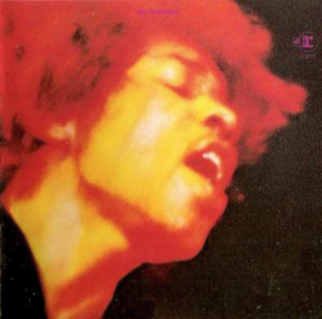
I would like to say something in support of trade colleague Ed Thrasher, the art director of the original USA version of the Electric Ladyland album. I may get hate mail for doing this, but it is my opinion that Reprise made the right decision to overrule Jimi’s wish to put the photo of the JHE with the kids (now used for the 50th anniversary release) on the front cover of the album. If anything, the final front cover of the original LP has become an iconic image, which – to me – captures the mood of the “Voodoo Child” and the whole vibe of the album better than the kids photo. It stands out from a thousand miles. Thrasher used the photo without any text (except for the Reprise logo) with a stunning result. A wise decision, both artistically as well as commercially. Jimi, as a musician and performer, could have had ideas about the way the record had to be presented to the public, but art direction and marketing are a trade, which needs vision and many years of experience. Now, with the 50th anniversary release of this album, we can see that the kids cover has nowhere near the impact the original one has.
It seems there was no real plan for the cover in 1968, as Jimi’s instructions were made at the very last moment, perhaps a consequence of Chas Chandler not being in the seat anymore. A sign of this may be the fact that they used photos on the back and front of the ELL cover that were more than a year old. Talk about good management! The inside of the fold-out cover was done as Jimi had suggested (possibly a gesture from Reprise to meet the artist halfway): A frame of small photos, with the LP info in the white space in the centre. The frame of small photos is a nice concept, but frankly an obvious choice, and not one that has the same impact if compared to the inside cover of the UK ELL album, or even the inside of the UK Axis album. Reprise chose to print the inside of ELL in black & white only (Jimi wanted them mixed with color pics) but the end result is not very good, as the printing quality is inadequate.
Jimi didn’t like the UK cover of ELL, which is understandable, as the photography of the naked ladies is terrible, most people agree on this, then and now. But here again: it was all marketing by Track. The cover may not have been what the art director had in mind, but all the papers talked about it. Artistically a bad choice, but commercially a wise one.


